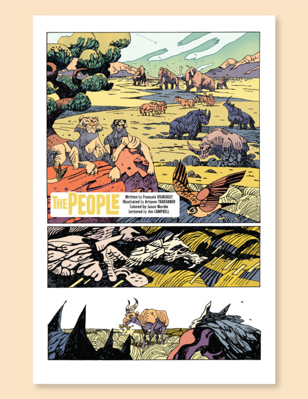
The Making of “The People”
My newest comic “The People” is hitting shops tomorrow as part of the latest issue of the new Oni Press limited series, XINO #2. The process on this comic was quite different from my usual methods, since I was the writer and was working with artist Artyom Trakhanov, colorist Jason Wordie, and letterer Jim Campbell to bring this story to life on the page, a very unusual experience for me! But it was honestly a pleasure, I was already a big fan of Artyom and Jason’s previous comic First Knife and I think that everyone really worked hard on this little 8-page comic to create something unique and fun!
Here is a little behind-the-scenes peek at the back and forth process of creating the first two pages of the story, from my script thru pencils, edits, inks, colors, and final letters. If you like what you see here do pick up XINO at your local comic book shop this week!
SCRIPT
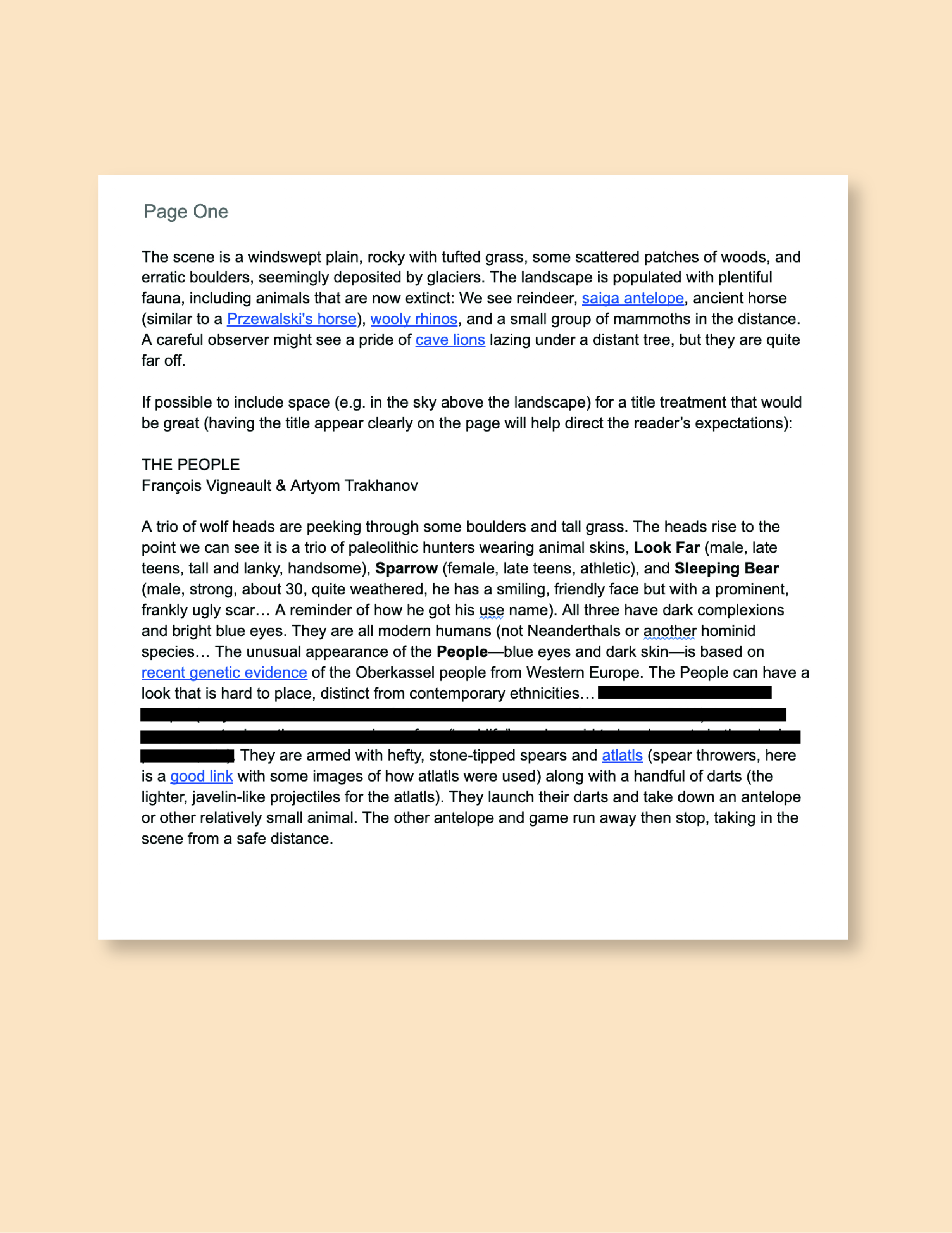
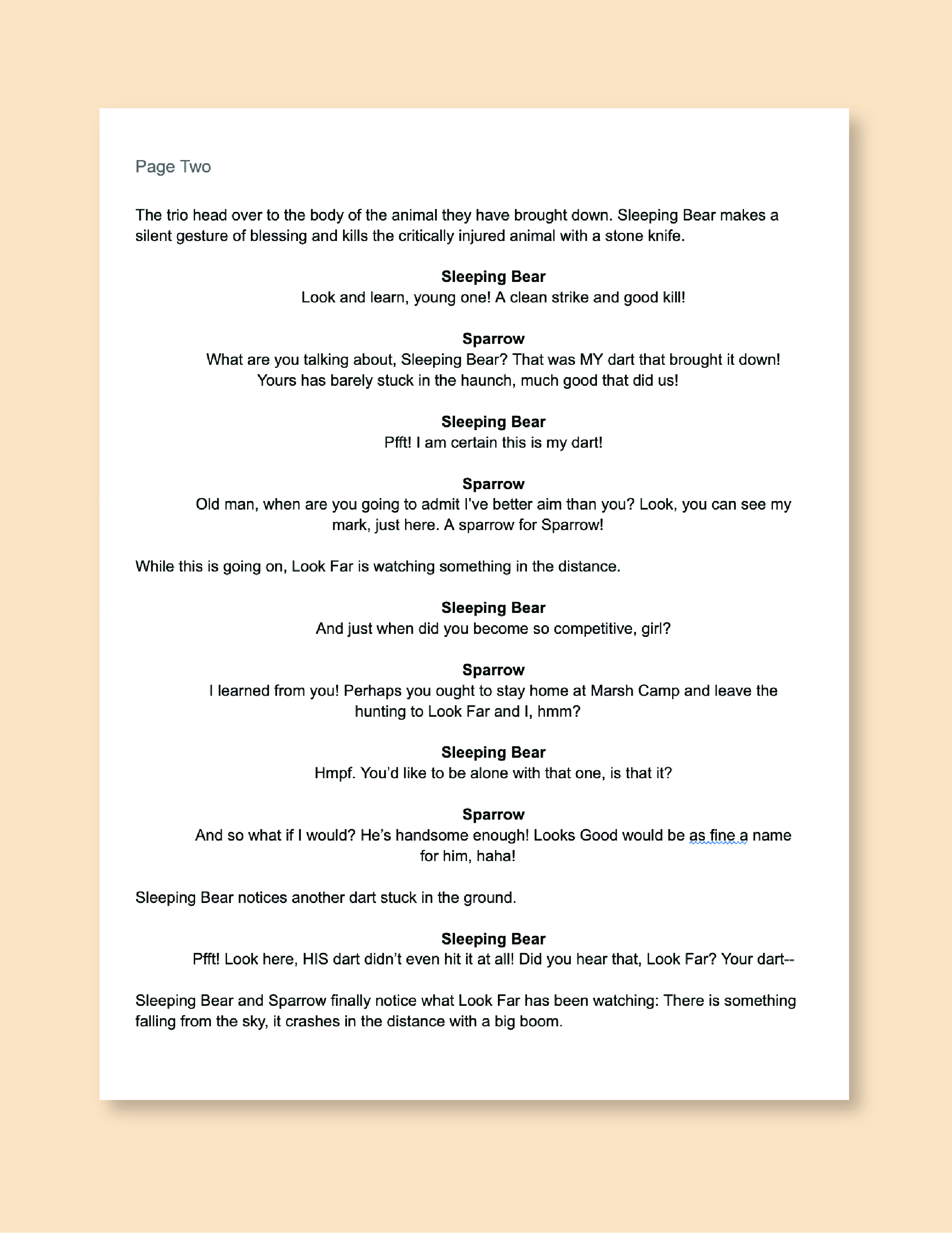
The first two pages of my initial script that was sent to Artyom. I’ve redacted a note on page one that is a spoiler for the rest of the story!
I had come up with my initial idea for this story a couple years ago, so when editor Zack Soto approached me about doing a comic for the second issue of XINO “The People” was one of three pitches I sent him and co-editors Gabriel Granillo and Jung Hu Lee. But it was really just an idea, I didn’t have a story or dialogue written at all, so I had to hustle and write up the comic in a week! Zack gave me a hard limit of 8 pages for the comic, and that was a challenge to get what I wanted to happen across in such a short space. I also didn’t want to use any direct narration, and have the whole story expressed in just dialogue and images, which is another restraint, but I am really happy with how it turned out.
I included quite a few links in the script that I thought might help Artyom out and streamline the amount of outside research he might have to do on things like what sorts of animals are present on these pages and the recent scientific research I was drawing inspiration for the distinct look (dark skin, blue eyes) of the People.
One thing you might notice right away is that while the script is broken down by page, I didn’t purposefully give Artyom any notes about how to split up the action and dialogue panel-by-panel. As I wrote to him:
“Artyom, throughout I have written the images, scenes, and dialogue I’d like to see on each page, but I am leaving you the freedom to layout the panels as you see fit—When I work on other people’s scripts I often find panel-by-panel breakdowns to be overly restricting of my work as an artist, and I tend to ignore a good part of it. I thought you would appreciate the freedom to layout your pages with as many or few panels as you like, and I have trust in your instincts as a visual storyteller.”
Having worked as an artist on a few different projects with different scripting styles, I do think that too much direction from the writer can really cramp my style, and I think that the relative freedom in a script like this pays dividends by allowing the artist to set the pace. I think Artyom’s pencils below show that to be very true!
PENCILS
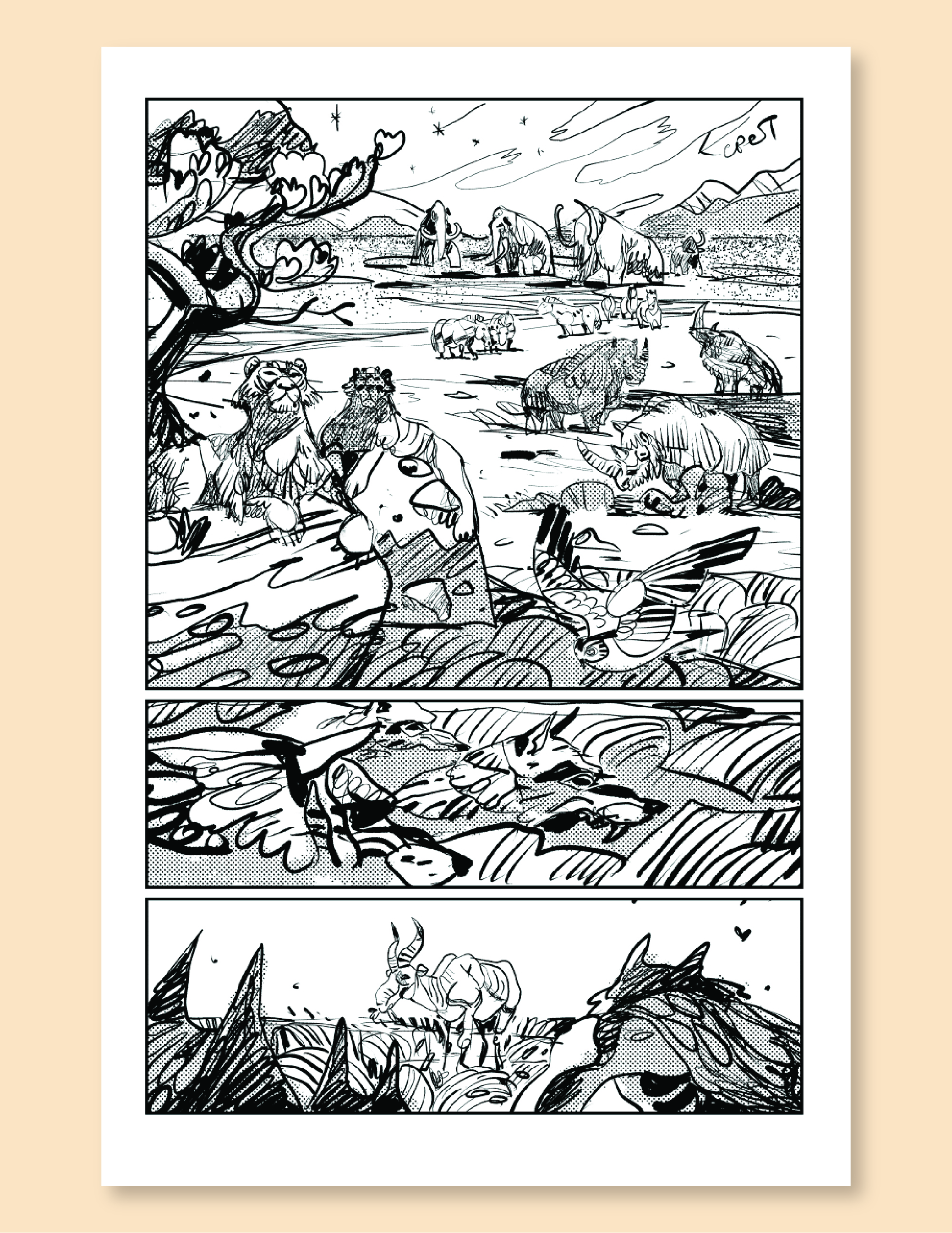
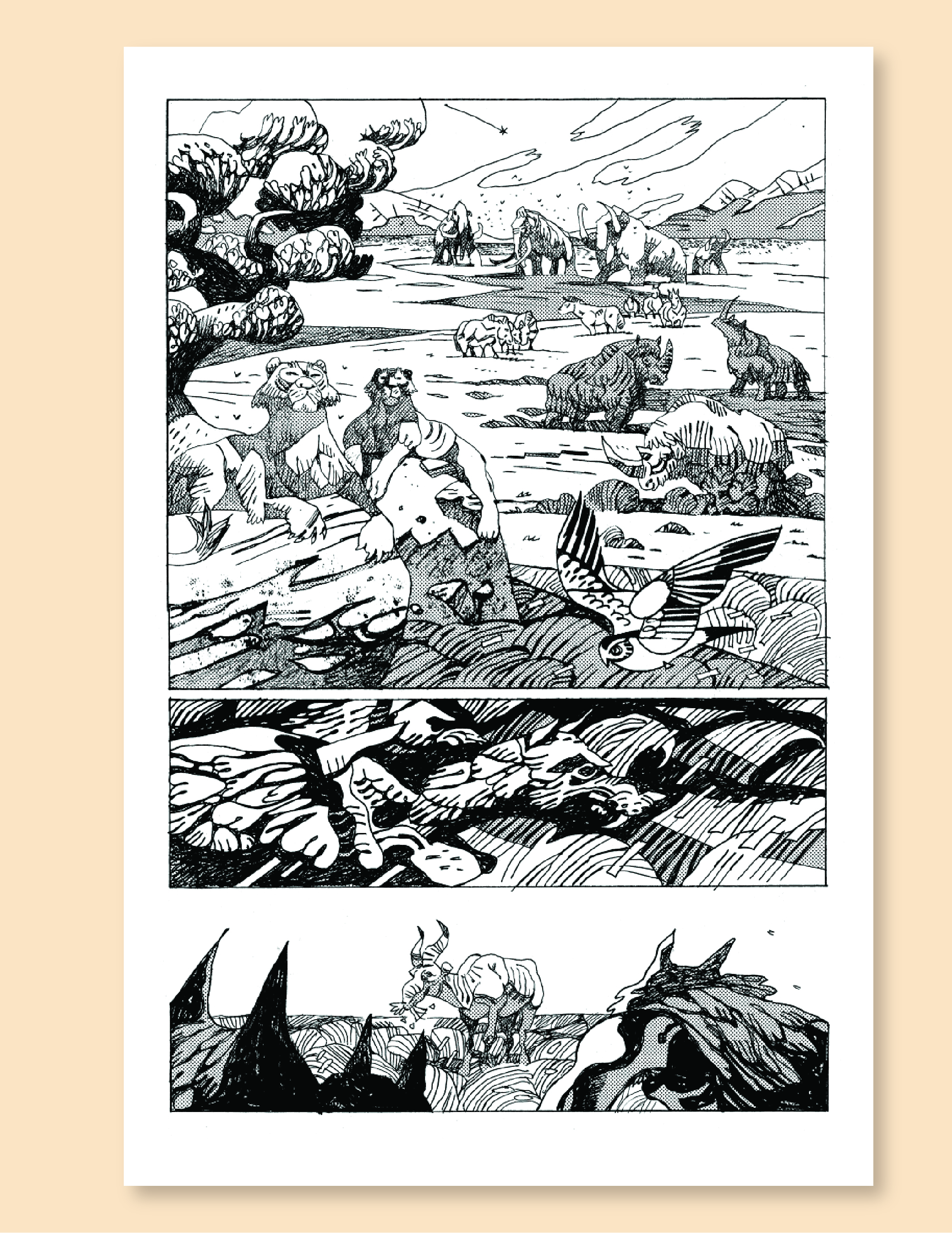
Here we have Artyom’s roughs/pencils. First off I was so excited to see this, it was honestly a trip to see characters and actions that I had concocted in my head realized by another illustrator, especially one who’s style is quite different from mine. I was super happy with the results.
If you compare the script and the roughs, you can see that Artyom made some significant cuts in order to fit the action on these pages, for instance the actual moment of the hunters launching their darts at the antelope happens in between pages one and two! But seeing it laid out it was obvious to me that Artyom showed excellent judgement on what could be left to the reader’s imagination, instead of trying to crowd everything on the page and ending up with something that was way too cramped.
ROUGH LETTERING
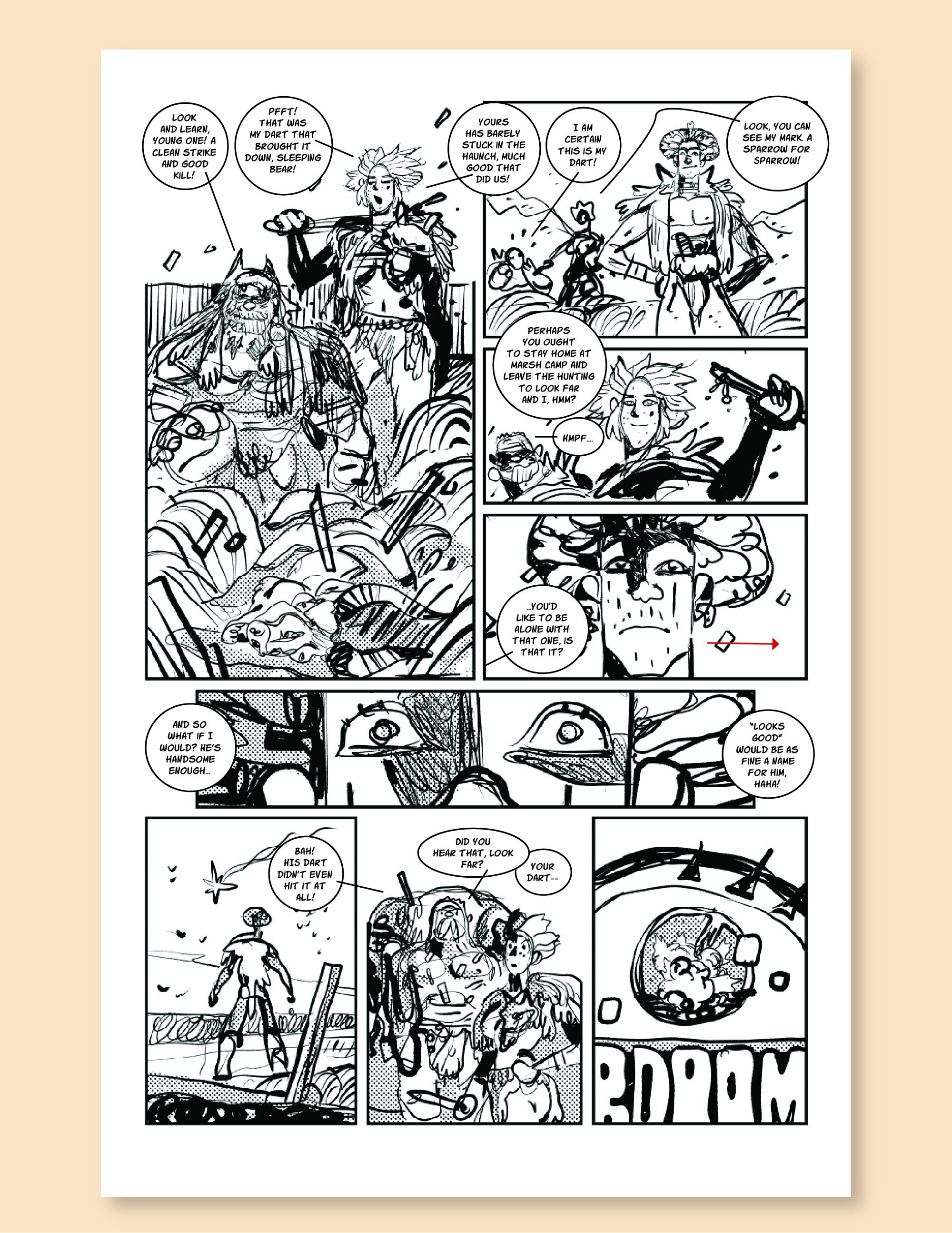
The next step for me was doing a really quick pass on the lettering to see what fit on Artyom’s roughs (page one didn’t have any dialogue so that was easy). Seeing the roughs made it clear that a couple little cuts could be made here (and throughout the rest of the story), such as little asides or character-building lines like “Old man, when are you going to admit I’ve better aim than you?” or “And just when did you become so competitive, girl?” These are what you might call “nice to have” lines, but they could definitely be cut here so that Artyom’s illustrations wouldn’t be overly cramped.
It is less evident on this page than elsewhere in the story, but I also rewrote several sections so that the dialogue would flow correctly on the page, sometimes giving a different character a line so that we wouldn’t have crazy long speech balloon tails snaking across the beautiful art (one of my big pet peeves). I had a few edits for Artyom as well, for instance the little red arrow on page 2, panel 4 referred to a note to move Look Far’s head over to better accommodate the dialogue (this was more pronounced in some of the later pages, which were quite wordy).
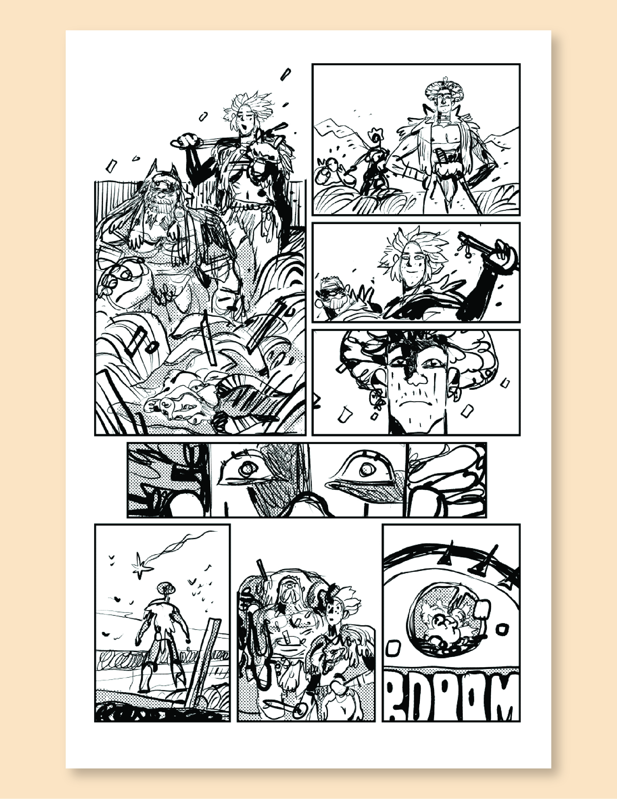
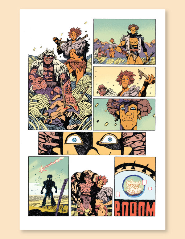
INKS
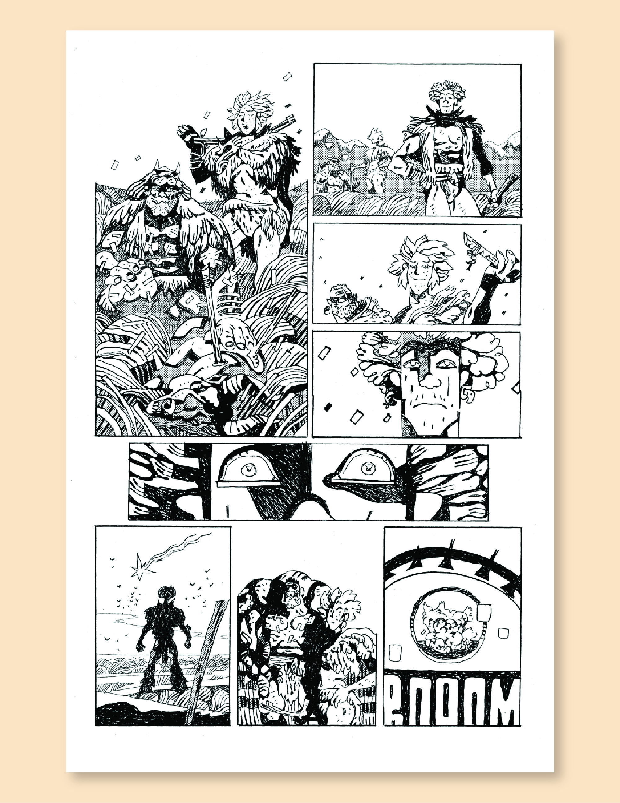
Next up we have Artyom’s lovely final inks for the comic, including some gorgeous screentone work. Obviously not to much feedback from me here, since I had gotten him notes earlier in the process and these just look gorgeous. If you wanna see more of his step-by-step process, Artyom has a great Patreon and he is running detailed posts over there, from roughs to inks. Well worth checking out and he runs a very active Patreon for his paying patrons!
COLOR
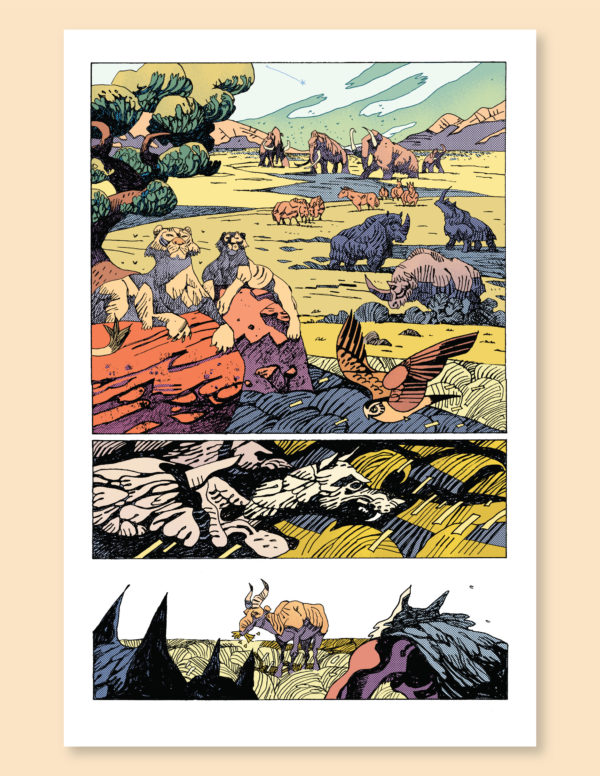
Here we have the final colors by Jason Wordie. There was a bit of back-and-forth to get here, I had a couple of suggestions and Artyom (who has worked with Jason before) had some very good and detailed notes for him. What an incredible difference it makes to see the world of “The People” in full color! I love the restrained effects Jason has here in the sky and the way he and Artyom work together to do a slightly desaturated linework/screentone/color mix so that everything blends so well together.
LETTERING
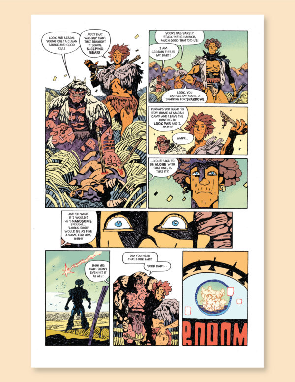
XINO letterer extraordinaire Jim Campbell came in at this point with his excellent rendering of the dialogue and word balloons. I had some nit-picky edits about placement (again, less so here and more on some tricky, dialogue-heavy pages at the end of the story) and Jim was kind enough to accommodate me, and I worked directly with him to get everything implemented (as a person who does lettering professionally myself it was really cool to get a behind-the-scenes look at Jim’s expert techniques!). This included a final round of tweaks to make sure everything fit on the page and obscured as little of Artyom and Jason’s artwork as possible. As a final touch I created the simple little “The People” logo, and we were ready to go!
And that’s it! Many thanks again to my teammates on this project, artist Artyom Trakhanov, colorist Jason Wordie, letterer Jim Campbell, and editors Zack Soto, Gabriel Granillo, and Jung Hu Lee (who all had some great ideas and feedback throughout). In the end I feel like this comic is probably my favorite collaboration yet, and it was fascinating for me to use a different set of creative muscles and have to rely on other talented folks to do things I am used to doing myself!
“The People” appears in XINO #2, out TODAY (7/19/2023). If you like what you saw here I hope you’ll pick it up, I think you will be surprised and pleased by what me and the gang got up to in the remaining pages of this short, strange tale of life in the Paleolithic Era! And if you do enjoy it, please do let me know, post on the socials about it, etc… I’d love to get a maximum of eyeballs on this story and build a little buzz, because I’ve got some ideas of where the story could go next!