Lettering in Translation: Q&A with Edward Gauvin
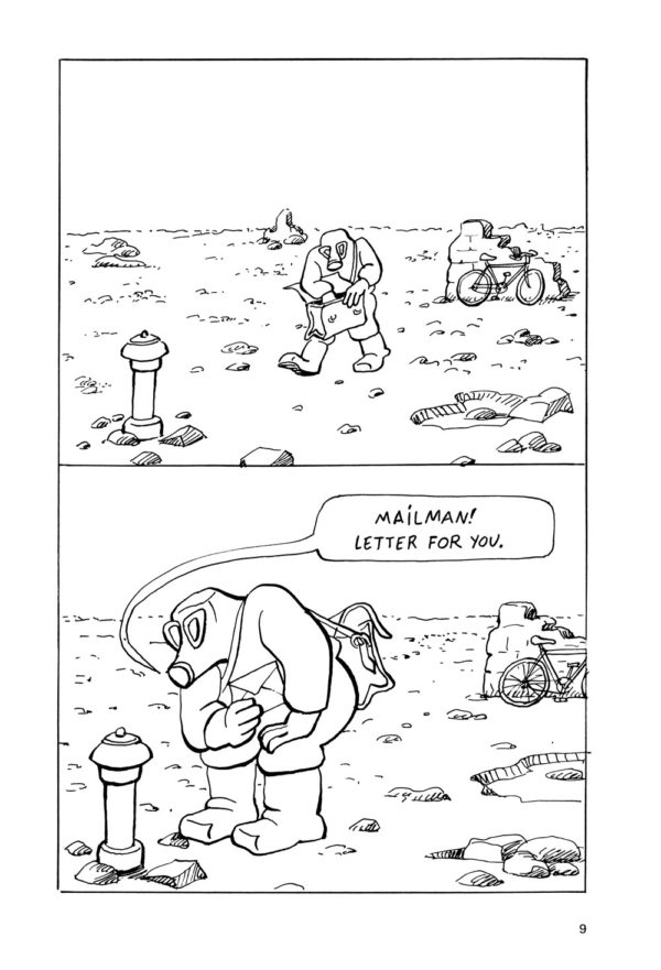
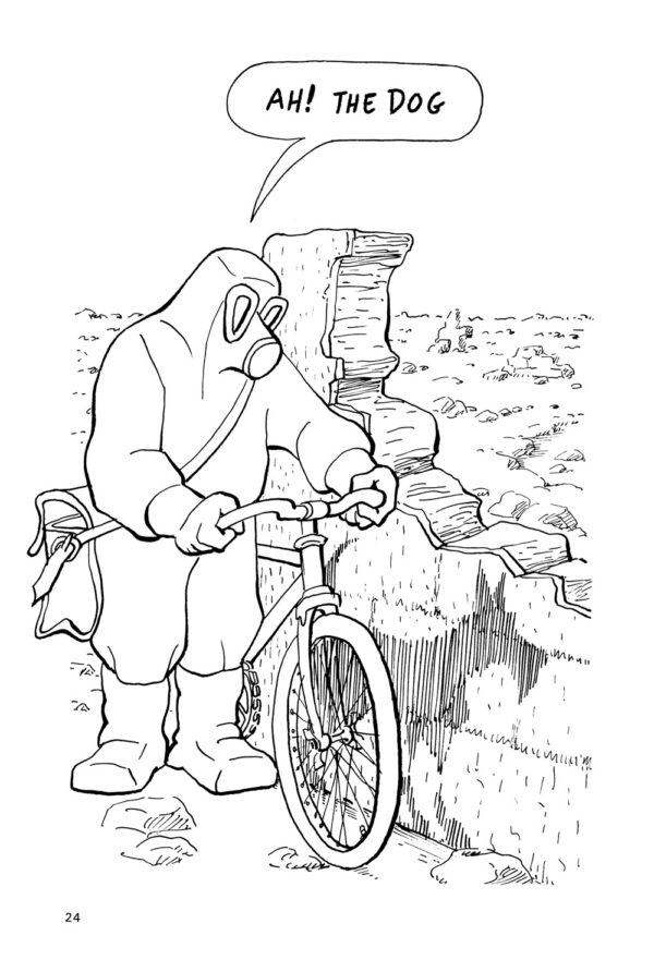
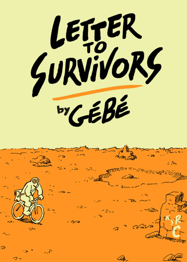
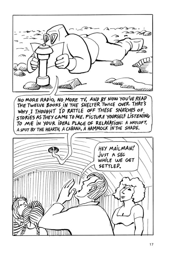
A couple years ago I had the pleasure of hand-lettering the English-language edition of Letter to Survivors, a biting post-apocalyptic satire created by the late, great French cartoonist Gébé. It was published in 1981 and was one of the first books marketed as a “roman graphique” in France. The new translation, published by New York Review Comics in 2019, was by Edward Gauvin, an award-winning translator who has worked on a truly staggering number of graphic novels (more than 300 titles!), short stories, and more.
Edward was a real pleasure to work with, a very detail-oriented and creative translator with a supremely developed feel for the subtle nuances in Gébé’s writing. He was very involved in every step of my lettering process on the book, with a ton of feedback on subtle elements like line breaks and spacing that many people might have missed, his approach to Gébé’s work often reminded me of poetry rather than prose. The resulting graphic novel is a very bleak, very funny dissection of the excesses of capitalism and consumer culture that sadly hits as hard today as it did more than 40 years ago.
Shortly after the project concluded, Edward did a Q&A with me via email about my process with hand-lettering this book and in general. This interview hasn’t appeared in print or online before, but since I have been doing more and more lettering gigs (such as The City of Belgium by Brecht Evens, Talli: Daughter of the Moon by Sourya, and an upcoming edition of Notes by Boulet) I thought it would be a great time to run it. As for Edward, he is as busy as ever, in 2020 a grand total of FIVE books he translated were nominated for Eisner Awards (in fact hardly a year goes by that Edward’s work isn’t amongst the Eisner nominees). I’m looking forward to my next collaboration with him! In the meantime I hope you enjoy this little discussion of the art of lettering in translation.
Edward Gauvin: Could you discuss your process in conceiving a lettering style for this book? To what extent did you try to copy Gébé’s lettering? Or did you make a conscious attempt to depart from it? Can you provide specific examples of differences, and talk about the thought process that led you to those choices?
François Vigneault: It took several attempts to get something that felt like Gébé’s original lettering… My early attempts were in general too tight, too strict in feeling. Gébé’s lettering is at times very idiosyncratic, changing in size and scale, becoming more or less italicized, bending to fit into his word balloons and sometimes running right across his art… I had to really “let loose” to get close to his style. At the same time, it was important that the English lettering closely match the line of the original artist… after all the lettering exists right there on the page with his artwork, I don’t want that to be jarring for the reader. Hopefully the art is “invisible” in some ways… If I did my job right few people will take note of my work, it will be as seamless as possible with the original.
EG: How close would you say this is to your own “natural” or “normal” lettering style? What are some specific ways you had to make a deliberate effort in making it different from your own style? How many different lettering styles do you think you’ve used in your own comics, like Titan or 13th Avenue?
FV: Quite different! I’ve used a wide range of lettering in my work, both hand-lettering and also creating digital fonts, but in general I strive to keep my own lettering as tight and consistent as I can… I feel like Gébé had a much more natural, improvisational style, adapting to his artwork. So I definitely made an effort to capture that more loose feel.
EG: What are some other lettering jobs you’ve done, hand and/or digital? How did this book compare with them? Is there anything you did here that you wouldn’t on other jobs?
FV: In addition to my own work, I’ve done a quite few different lettering projects, often creating fonts from some other artist’s handwriting (Luc Bossé, Zack Soto, Sophie Bédard). I’m currently doing the hand-lettering on City of Belgium by Brecht Evens (the English-language edition of Les Rigoles), that’s going to be coming out from Drawn & Quarterly… A very multi-layered project with many different typeface styles, colors, and more.
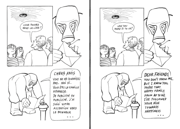
EG: Were you aware a digital font based on Gébé’s handwriting existed? You can see it in use online here, in an excerpt from Letter to Survivors published in 2012 in Words Without Borders. Were you aware of this publication, and if so, did it influence your work?
FV: No, very interesting! I hadn’t seen that before. That actually reminds me of some of my earlier attempts to tackle Gébé’s style… It works well and looks pretty good with the artwork, but it’s also a bit too tight, it inevitably lacks that true variation you get in his original, and (hopefully) in my hand-lettered version… Something like this definitely could have worked but I for one am really glad that we did the fully hand-drawn text for the book.
EG: Were you familiar with Gébé’s work as a whole before starting? Had you read this book, or any of his others, or seen his Hara Kiri and Charlie Hebdo strips? If so, did that influence you in any way? If not, did you feel any need to look him up, or do you think that is irrelevant to the letterer’s task?
FV: I was definitely somewhat aware of him from Charlie Hebdo and also that Lettre aux survivants was a part of L’Association’s publishing history, but I hadn’t read much of his work, so I came to the project with pretty fresh eyes. A very interesting introduction!
EG: This book was originally published in France in 1981, then reprinted in 2002, and translated into English in 2019. Is there any tinge of “era” to your hand-lettering here? Was there any attempt to make it feel retro, or conversely, more contemporary? How would you characterize Gébé’s lettering—how it makes you feel—if at all? What are some expressive qualities you tried to impart to your own? Was there a mood (or several) you were trying to capture or convey with your lettering?
FV: I definitely think that this work has a certain “punk” or even an “underground” feel (no pun intended), that I think is partially an artifact of its age, maybe even something you might call “retro.” I’m not sure what Gébé’s actual technique was when he was creating Letter to Survivors, but to me it feels raw and direct, as if he was drawing and writing and lettering right on the page. So to me it was important to try to capture that improvisational feel.
EG: What is your lettering process like? I presume hand-lettering is easier than designing a typeface, yet still calls for some consistency and regularity. What counts as a “mistake” for you, that would cause you to re-do a passage? (Here I don’t mean things like spelling a word wrong: I’m more interested in what exactly informs decisions like “That doesn’t look right, so I’m going to re-do it”—unless that never happens.)
FV: I worked digitally, right over the original artwork and lettering so that I can get as close as possible Gébé’s placement, particularly when it comes to line spacing and character size. This also has the advantage of always keeping the artist’s original letterforms right in front of me, so that I don’t accidentally stray too far. I’ll frequently redraw a word or even a single letter multiple times, if it doesn’t feel like it’s working I’ll just erase it or “undo” and draft it again, over and over sometimes! But the good thing is that this allows me to be bolder with my initial strokes and lines, to be a little reckless, and I think that really helps to approximate the feeling of a book like this. I also left in many minor “mistakes” if I felt that they looked right…. A too-thin stroke, or a little ink blob, that adds to the “hand-crafted” quality and I don’t mind that at all. More rarely, I had to re-do whole passages, or otherwise do some major edits… Often if it turned out that the English translation didn’t fit neatly into the space in the original art. That’s not very fun!
EG: Did you read the book in French before beginning, or only my translation? Does reading the whole book help, or doesn’t that matter? Did your opinion of the book change over the course of your work on it? Are some books fun to read but not fun to letter, or vice versa, and what aspects affect that?
FV: Actually, I read both the original and your translation in tandem, very slowly and carefully as I did the lettering. It makes for an interesting reading experience, you have to pay attention to each and every word and phrase, and you become very aware of little nuances in the author’s language and style.
EG: Lettering your own comics also involves placing dialogue balloons in ways that are harmonious to the overall pictorial composition. I assume you didn’t have to do that here (did you? Was enlarging or shrinking any balloons an option?), but what are some design elements (ex. white space?) that had to be considered in lettering this book?
FV: We tried very hard to never alter Gébé’s original artwork or word balloons, even going so far as to preserve his “mistakes”; when a word in the original would run over the edges of a word balloon, for instance. But I definitely had to consider where the white space was on the page, trying to replicate the original, which sometimes had unusual line breaks and other things that made the white space quite striking, visually. But again, this wasn’t so much a creative effort as an effort to try to seamlessly recreate the original feeling of the work, with all its little quirks.
EG: What was the hardest page in this book, if there was one? Can you walk us through what made it hard, any problems, and how you solved them?
FV: The hardest pages for me were right at the beginning, when I was still trying to figure out Gébé’s style… I think I did eight or more versions of my initial test page before I got it right! But once that was in place the project moved forward smoothly.