Titan #2 Process
[Note: This is the sort of post I will usually be making a Patreon exclusive, but since we are just starting out here I thought I’d make it available to everyone! Enjoy!]
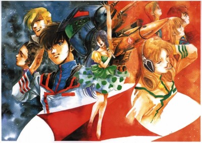
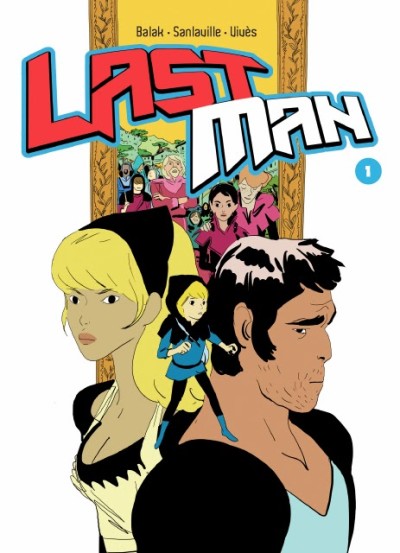
I did my initial design in Manga Studio 4EX, which is the program I have been using to draw the interiors for Titan since midway through the current issue. I knew I wanted to do a multi-figure painting along the lines of old Robotech images or more recently Bastien Vives’ Last Man covers:
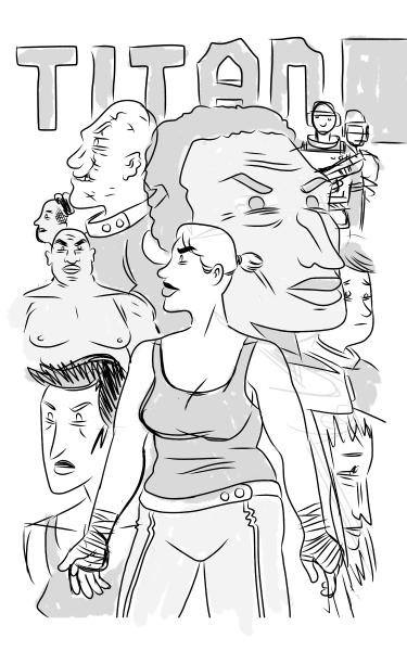
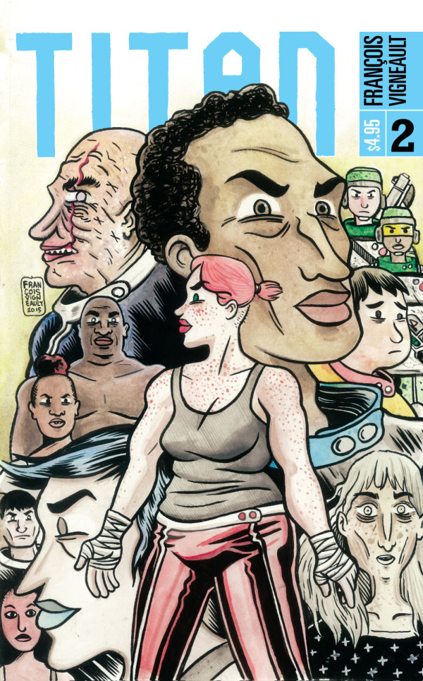
I drew the different figures on individual layers, which allowed me to mess with the placement of the characters before committing to the final design. I knew I wanted Phoebe to be the focus of the cover, since this issue is largely about shifting the focus towards her.
One thing that surprised me and made me happy was that by the end of the second issue, I have a fairly large cast of characters to draw here! In the design below you’ve got (clockwise from the top) João, Pvt Boyle and the as yet unnamed female SEC-OPS officer who appears a couple times in this issue, Joans, MNGR Alyce Cheng, Phoebe, Sonja, Ramona, Alexi, and Cyrus. You’ll see further down I ended up adding a couple small portraits of the bartender Dani and Phoebe’s old opponent.
I had originally been considering doing the entire drawing digitally, but in the end I decided it would be nice to do an actual painting… Shifting to an all digital workflow is great for speeding up my work, but it is a little sad that I am ending up with ver little in the way of physical artifacts of my process. I’m really glad I have this cover in real life!
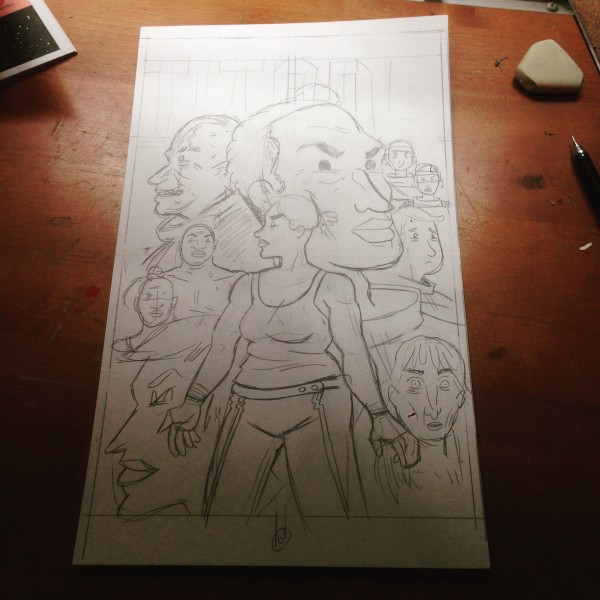
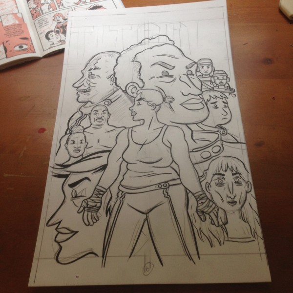
Here we have my pencils on Bristol Board. I drew this at the same size as I used to draw my pages, about 2x the size of the final. In comparison I painted the covers of Titan #1 about 4x larger. I didn’t grid things out, and you can see I made quite a few changes here.
Inking linework. A lot of my drawing happens with the pen or brush, rather than in the pencils, so most of the time I’m going to ink the drawing first, before painting with the watercolors. That means I’ll have to go over the inks again later, since the watercolors will inevitably muddy them a bit, but for me it works.
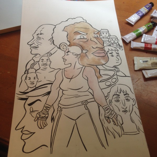
I’ve been making watercolors for a few years now, but I’m by no means and expert. I’d like to develop a looser style over time, and learn more advanced techniques, but for now I can usually create something I’m quite happy with. I try and take it easy and be patient, doing as many layers as I can… But I’ll get antsy and start adding too much paint from time to time.
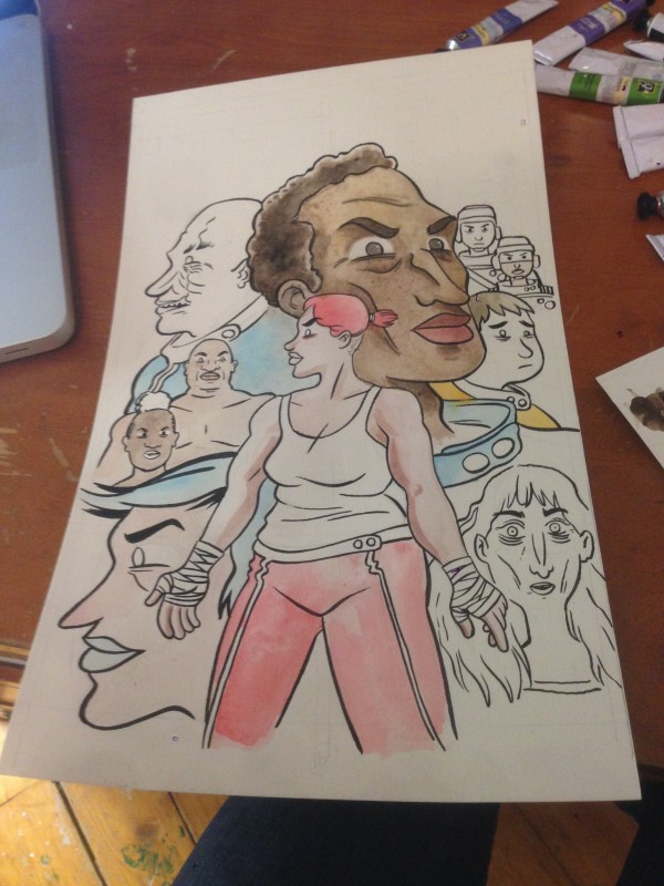
One thing that is fun about doing the color covers is that I have to make decisions I can ignore in the interior of the book, which is in duo-tone. How dark is João’s skin, for instance? He ended up lighter in this cover than on the cover to number 1, not through any intentional choice, but more the vagaries of my painting process. I might have to make him a bit darker on the next issue to balance that out. Other things: What color is ASST MNGR Joan’s uniform? How about yellow? What about Sonja’s hair? I thought blue would be cool, and I gave her blue lipstick to match. I always liked the multi-colored hair sported by characters in Robotech, and I thought the matching lipstick had a futuristic look. Phoebe’s hair isn’t naturally red, either (that will be made more obvious in future issues), so I liked the idea of the Titan’s having these punky, short, colored hairstyles.
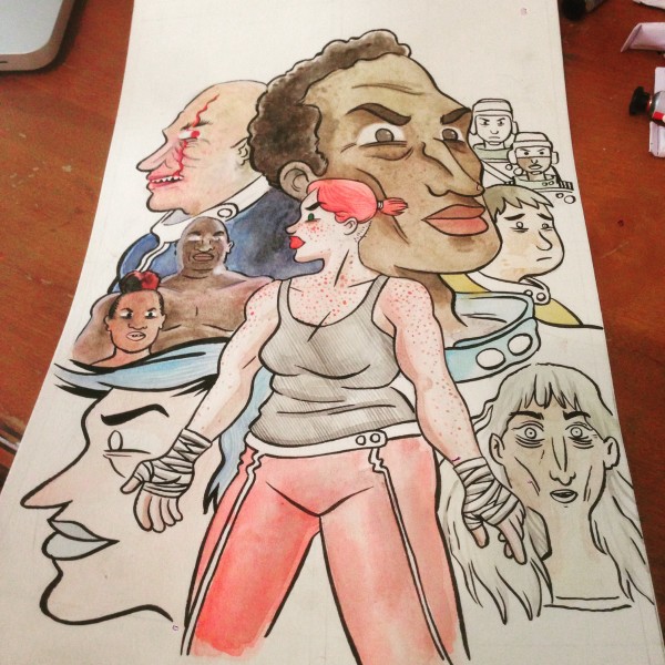
Adding more textures now… Phoebe’s freckles are always the most fun to draw. You can see I was having a hard time with Cyrus’ skin, which I want to look burnt.
The two small figures appear on the left… I realized the art bled of the right edge but not the left, and I thought it was unbalanced.
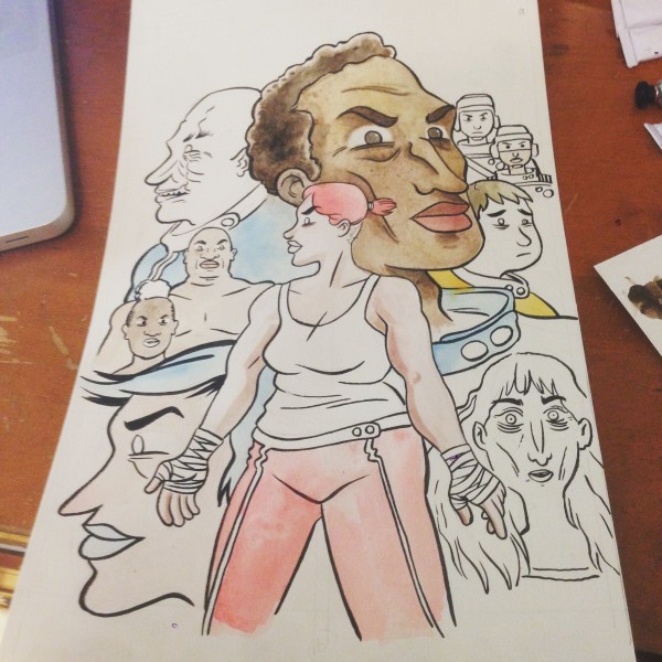
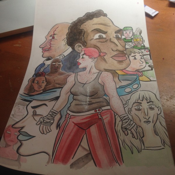
 Here we have my (just about) final inks on top of the painting. I kind of rely on deep blacks a bit much in my art, if I was a more confident painter I’d be able to develop the colors more fully and not have to ink so much… But I feel pretty good about this! You’ll see that I went in and added more textures at this point… Seeing the deeper blacks lets me know what areas need to be developed further.
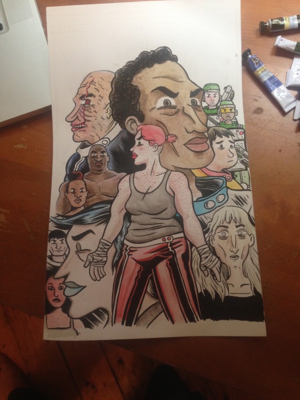
Finally, I scanned the final painted art, brought it into Photoshop for some minor color corrections, then placed the file into Illustrator. I had already established the general design with the cover to Titan #1, so I just changed the colors and pertinent details, and I was done! Oh, one trick I learned with the first cover that I used here was to create a clipping mask for the cover painting where the elements overlap the title. Then, I place a second copy of the art, uncropped, behind the title. This sandwiches the “Titan” title between the two copies of the cover and makes for a nice effect.
That’s it! I hope you enjoyed that little sneak peek into my painting and design process. Please let me know in the comments if you have any questions! I’ll be revisiting the cover soon, because I want to show you the really cool back cover art by a guest artist, along with some elements of the book design that I am really liking.